
Should We Use Value Charts?
featuring Mitch Baird
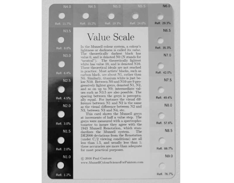
Mitch often discusses the idea using the Munsell value chart/card in vs. the way we should be seeing value as artists. The Munsell chart is actually measuring light…but we are not concerned with light. We are concerned with reflected light from an opaque object. We do not see the light, we see the light reflected to us. It is a whole different concept because we are seeing value reflected to our light from an object. This means NOT looking at the actual light spectrum. The Munsell chart has caused so much confusion on the idea of “9” being white and “1” being black (see image below). This is confusing because this has not been the historical case. Way back before artists drew from the cast (meaning white cast model), the highlights were the ones that were up high (1) and then they went down in value into shadow and darks (9). So, in that case, the darks would be a “9” and the highlights are “1'.” This is why the Munsell chart has confused artists for generations!
Munsell Chart
You have to be aware that the Munsell chart is not how we see values. This can relate to the idea of the card itself. You can do this exercise at home if you have a Munsell card and it makes a difference in what you are seeing: If you hold the card flat, the lights going to be lighter on the card itself than if you hold it up vertically. If you are standing in the light with light on the card, it will have a different value than it will with the card in shadow. So now, when you make the comparisons of value you see out on the feild, you are comparing it against the card. Well, if the card is in the light, it will be bright and the holes will be darker. Opposite in shadow. What then happens is the card is causing you to see value differently depending on how the light is hitting the card. This is not what the card is used for, but you can see why the chart fails us because it is not a direct depiction of how we see values.

It is best to not rely on these “tools” because they become more of an inconsistent crutch. Rely more on your eyes and seeing the value that is out there that is based not on the card, but rather the field of vision. If there is a dark area in the field of vision, you can use that dark against the lightest thing in the field of vision. Try to learn how to see the values in the field and use your palette as your value scale, too. If you look at the white on the canvas and say you have ultramarine blue, you can use this sort of spectrum as your “color card.” This way, you are using the values on your palette to match the values in the field.
Want to learn more from Mitch Baird? Have Mitch as your mentor and join him for his next open enrollment period!