
Exploring Color Temperature
Skip Whitcomb received a question in his course regarding color temperature: Does he consider Ultramarine Blue cooler than Cobalt Blue?
Here is Skip’s answer for you!
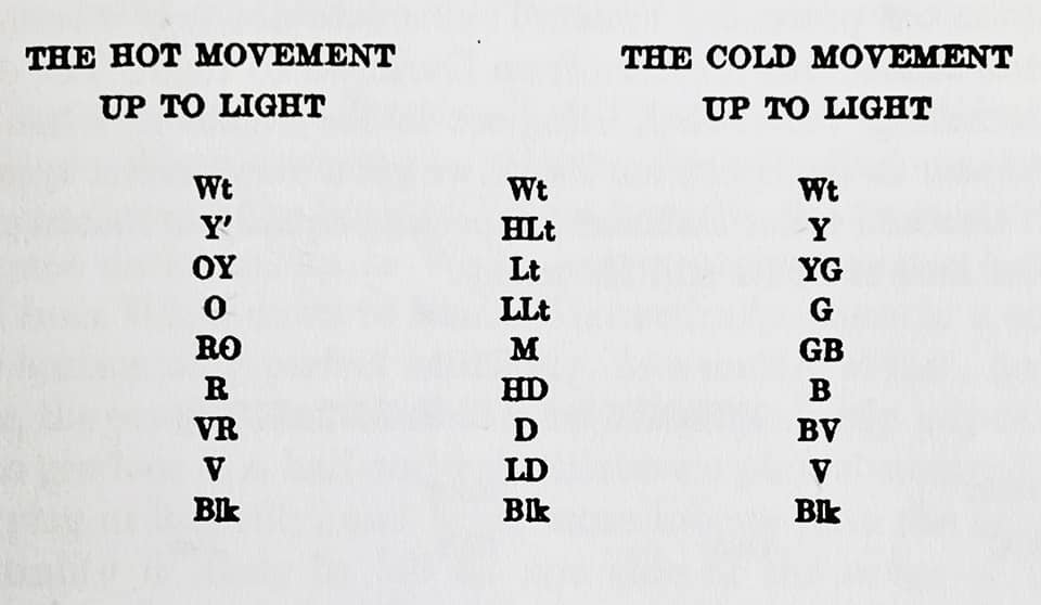
“Color and color temperature is ALL relative!” This is the key for everyone. There are no hard and fast rules, only suggestions that will increase the possibilities of creating color harmony. Suggestions such as: the fewer colors used, the greater the harmony. This chart Skip uses below to illustrate is made up of the “ideal standard colors,” and we can argue their existence in the real world. They are generalizations, for the most part, to create some sort of yardstick to “measure” our color choices.
By training our eyes to discriminate the color and temperature subtleties (in relation to what is around them), we, in turn, refine our color statement. It’s all about understanding what our palette is capable of delivering, thus the importance of doing a color chart(s) for each concept.
Skip says ultramarine blue is warmer than cobalt because it has a red shift. Cobalt is considered the purest true blue that doesn’t lean one way or another. This is why we often mix our near greens with Ultramarine and distant greens using Cobalt.
This teaching came directly from Skip’s private group for his course “The Power of Orchestrated Color,” that has open enrollment three times a year. Click below to join the waitlist for Skip’s next course opening!