
If Values Suffer, Paintings Suffer
By George Strickland
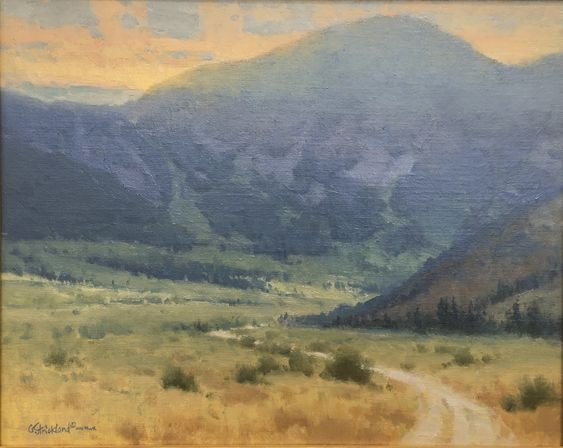
The word VALUE in painting refers to how light or dark something appears. That could be a scene and its varying areas of light and dark, or it could be referring to a pigment’s lightness or darkness if represented in black and white (b&w). If you were to shoot photos with b&w film, your pictures would be represented in different shades of gray or value. We just use “value” as a way of describing how light or dark something is, including our paint mixtures. We can describe a value from an increment scale usually confined to 10 or less shades.
It is essential to know that in painting, colors can be right on, and the design can be wonderful, but if the values are wrong, your painting will surely suffer. It is the bedrock art tool for composing a painting, explaining form, and seeing the magic of making paint appear like the actual thing on a canvas.
Color is not to be slighted here, but values are the underpinning of your painting that design and concept lay upon, usually making or breaking it. Back a few years ago, we only had black and white photos, printing, and movies. Great examples are archived from those periods, with many being genuinely exceptional. Without color at their disposal for reproduced media, illustrators, photographers, and movie directors routinely used value to convey the mood of scenes. It proved what a big deal value played, and when we see a colorized version, we know that is only possible because of that excellent b&w base.
There are painters past and present that paint in monotone, then put color on top of that dried version as a value guide. It is an approach that is labor intensive (too much for me), but it has produced wonderful work. I imagine that technique being impossible for plein air painting with its time constraints, etc., but I mention it to emphasize how significant a consideration value is.
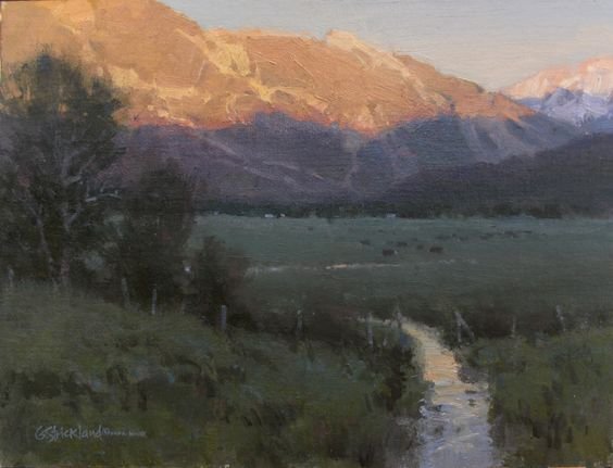
Through the years, artists have discovered the need to simplify values down to a manageable few. Value simplification is one of the great secrets of a good painting. It is necessary because of the limitations of paint doing their best to simulate sunlight light on a canvas. We never wear sunglasses when looking at our paintings because a light usually illuminates them in our house or window light will, and even that is diluted compared to sunlit landscapes. So when you hear the term "simplify," it primarily implies value conjoining to help us translate natural light and shadow into paint. Additionally, simplification can mean removing unnecessary objects or grouping things, such as trees, brush, rocks, etc., into clusters in a landscape painting, but that would be another topic.
“Color is not to be slighted here, but value will be the underpinning of your painting that design and concept lay upon, usually making or breaking it. ”
The best way of simplifying values is to squint your eyes at a scene to identify values relatively close to one another. If they are close, they will appear to meld into one like value. A scene simplified and blocked in with four or five values will represent objects in a very powerful way… plus, this simple approach will make a complicated scene much more approachable for you in the beginning. Then, as more values are needed for refinement and nuance, they can be carefully added.
From start to finish, values are a prime consideration. In the beginning, our thumbnails can identify simplified value shapes to get us started. On our canvas, we can apply that same simplicity to the values of our colors. With a little practice, it gets to be part of your painting process and a way of making what seems complicated much more straightforward.
Find out how to learn from George Strickland today: