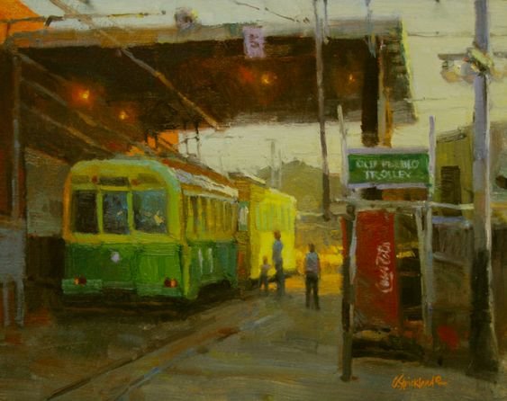
DESIGN by George Strickland
Like the layout and planning of a beautiful house before building, DESIGN starts at the very beginning of the painting process. Consideration should be given to what is important for the painting to convey. To do this, you might ask yourself questions like “Why do I want to paint this particular scene?” or” What do I find most compelling about it?” I try to do this at the beginning of every painting unless I am just copying exactly what I see to learn something as a study.
Once I determine what is important, I start designing with small thumbnails, keeping my placement and size of the larger shapes the first order of business. I use a cropping tool like a View Catcher, a camera, or even my fingers/hands to make a rough rectangle to look through to the scene and visualize how to place these big shapes on my thumbnails. I may do one or even 20 to 30 thumbnails until I find what works best. Usually, the larger studio paintings deserve a lot of thought and planning (more thumbnails), while small paintings done on location require more urgency to start and complete (I enjoy these!)
If I am painting for a plein air event, I try to arrive early and drive around doing thumbnails at locations so that when the event starts, I can go directly to those spots. I sometimes do a thumbnail on my painting panel in one corner, using thin paint. Later, as the painting develops, I wipe it out and paint over the area. I want the thumbnail design to suggest how my eyes will travel through the painting onto the main focal point. I will try to have contrast, color, interesting shapes, etc., in the focal point area, just like the apex of a book, play, or piece of music might have.
It is always good to have a variety of big shapes and sizes. Evenness in any form can often make your design less dynamic, so try not to have trees in a row like soldiers or two mountains of equal size side by side. For instance, objects just barely touching become distracting tangents. Things up against the edge or directly in the middle of the canvas can undermine the design. You might divide your canvas horizontally and vertically into thirds, where the lines intersect can be good spots for significant focal points.
Rules and guidelines are a place to start, but I must say rules like those mentioned are made to be broken, especially in design. Don’t ever feel you must adhere to narrow rules constantly, or you will never reach beyond the norm.
- by George Strickland
To learn from George Strickland, we recommend his video download series. Find out more here:


